BudgetBuddy
June 11th 2024 to June 26th 2024
A 15-day freelancing project for a small startup company. Working in a small team of 4 people: a project manager, a full-stack developer, a graphic designer, and myself.
My Role: UX/UI Designer
The Backstory
In early June, I joined a small freelancing team to work on BudgetBuddy, a financial budgeting app designed to make money management approachable and stress-free. Our team included a project manager, a full-stack developer, a graphic designer, and myself as the UX/UI designer. With just 15 days to create a prototype, efficiency was crucial. The concept behind BudgetBuddy was to help users track their spending, set savings goals, and manage their monthly budget in a way that felt friendly and easy to use—not overwhelming. We were excited to take on this challenge and deliver an app that would feel more like a budgeting companion than another financial chore. Our goal was to make budgeting intuitive, simple, and visually engaging—appealing to users who want control over their finances but don’t have the time or energy to spend hours managing them. The tight 15-day timeline pushed us to design an MVP (Minimum Viable Product) quickly while still maintaining a high standard of usability and design. The challenge was to meet the needs of users like James, a busy professional who simply wanted to track his spending and work toward financial goals, without the complexity of other tools.
The Challenge
For BudgetBuddy’s 15-day sprint, the theme was "Simplified Finances, Empowered Goals." The mission was clear: to create an app experience that makes budgeting feel manageable, achievable, and straightforward for users like James—someone who wants to stay on top of his finances but doesn’t want to waste time or get overwhelmed by complicated tools.
We began by understanding what mattered most to James and users like him: he wanted a budgeting solution that was easy to navigate, provided clear insights into his spending, and allowed him to set and track savings goals for things like travel or future investments. Through user feedback and brainstorming, we pinpointed one major challenge: existing financial apps were either too complicated or too simplistic, lacking the balance of personalization and clarity that users needed.
James’s quote highlighted a common struggle among users: they want to keep their finances in check without diving into complex tracking or worrying about every small detail. Many existing budgeting apps overwhelmed users with too many features or failed to give a clear, quick overview of their financial health. This insight became the heart of our challenge—creating an app that is both simple to use and robust enough to help James take control of his finances.
With this goal in mind, the sprint challenge was focused on three main objectives:
Create a Simple, Intuitive Dashboard: Design an easy-to-use interface where users like James can instantly view their spending, savings progress, and budget status with minimal effort.
Integrate Smart Budgeting Tools: Build features that allow users to set clear goals, track their expenses automatically, and receive helpful suggestions without feeling overwhelmed.
Ensure a Personalized User Experience: Make the app adaptable to James' individual needs, offering simple features that provide insights tailored to his specific financial habits and goals.
In the end, our goal was to create a financial tool that felt less like a chore and more like a supportive partner, helping James and other users stay on top of their finances without the complexity or stress.
“I want to stick to my budget, but I don’t have time to manage every little expense. I just need something that shows me where I stand and helps me stay on track.”
— JAMES, 28
Research & Planning
James's persona will guide us in shaping the app’s user interface, flow, and features to ensure we meet his needs and preferences. By putting ourselves in James' shoes, we can design an experience that is intuitive, straightforward, and highly functional, allowing users like him to manage their finances effectively without feeling overwhelmed.
Key insights from James’ persona that will shape our design process include:
Ease of Use: We need to prioritize simplicity. James doesn’t want a complicated interface—he wants to be able to quickly check his budget, see where his money is going, and track his goals without unnecessary complexity.
Clear Financial Overview: James needs an easy way to visualize his spending and savings. This means integrating clear charts, progress bars, and notifications that give him a snapshot of his finances at a glance.
Goal Tracking: James values financial goals, so we’ll focus on features that allow him to set, track, and reach goals, like saving for a vacation or paying off a loan, in an intuitive way.
By keeping James front and center throughout the design process, we’ll ensure that BudgetBuddy delivers a streamlined, user-friendly experience that makes managing finances feel less like a chore and more like a proactive, empowering task.

Designing the Solution
Early Sketches:
I began the design process by creating rough, hand-drawn sketches of the app’s key screens and features. These sketches were quick and simple, allowing me to experiment with layouts and visual hierarchy without getting bogged down by details. My focus at this stage was on core functionalities such as:
Tracking expenses
Setting savings goals
Viewing the monthly budget overview
These sketches helped me visualize how users would interact with these features and gave a foundation for what would come next.
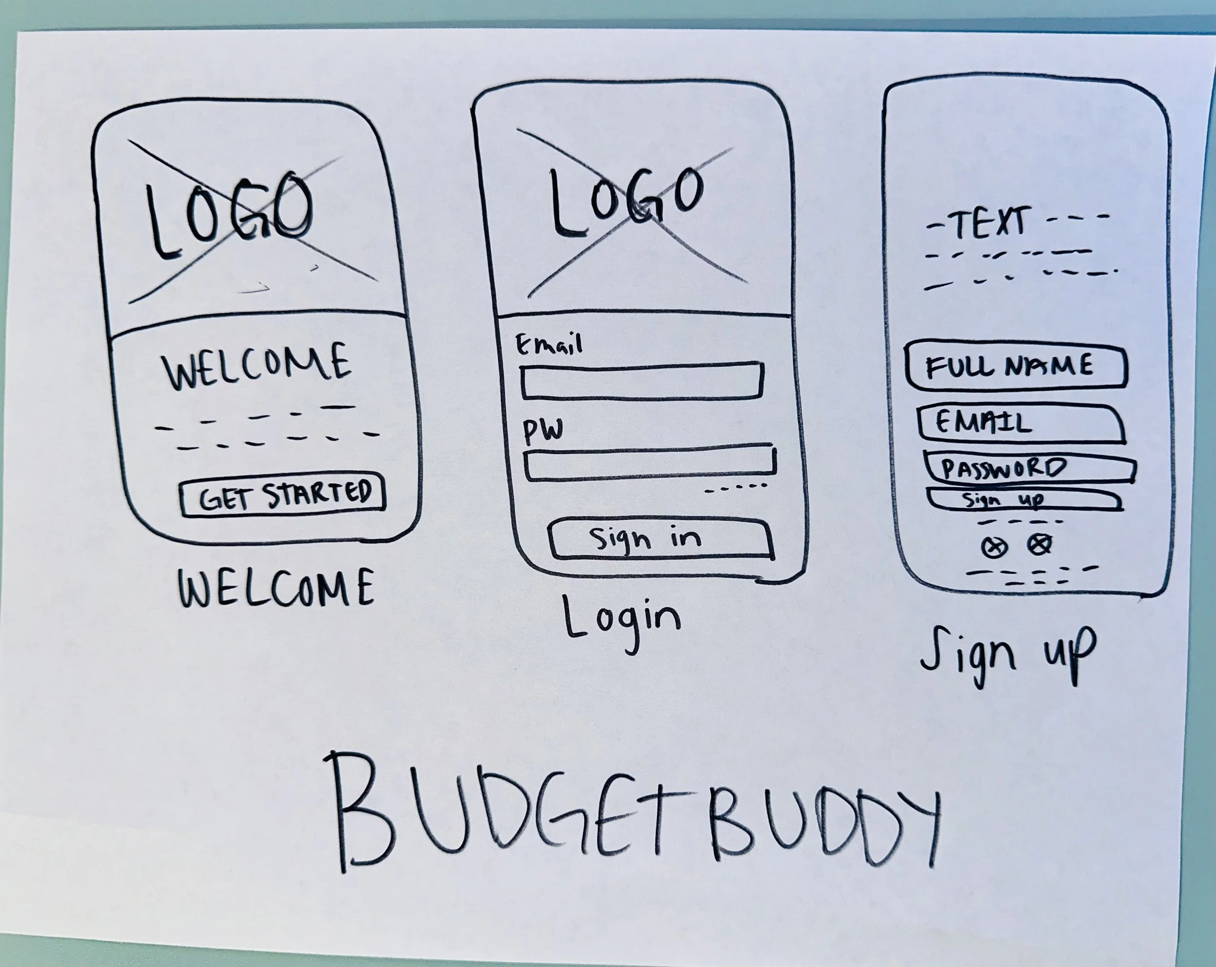
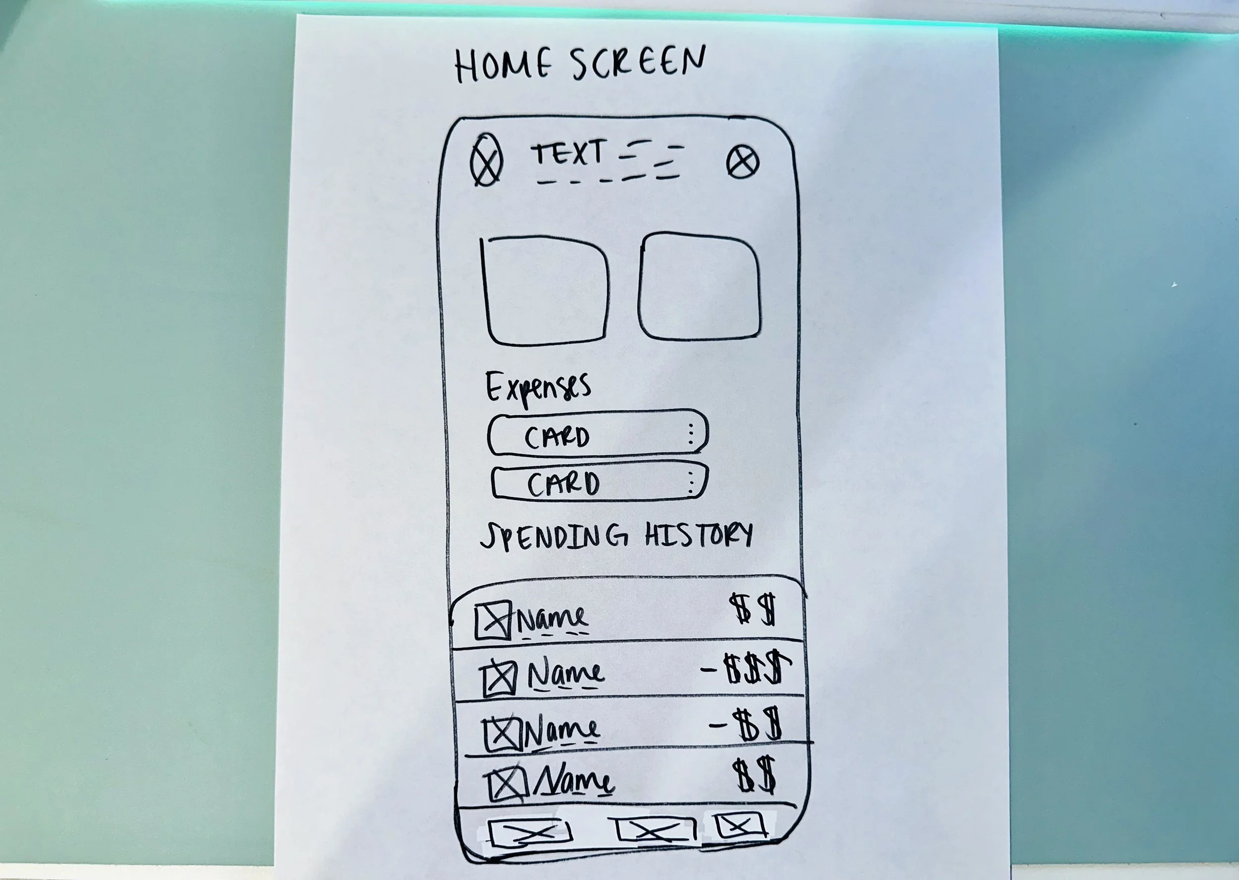
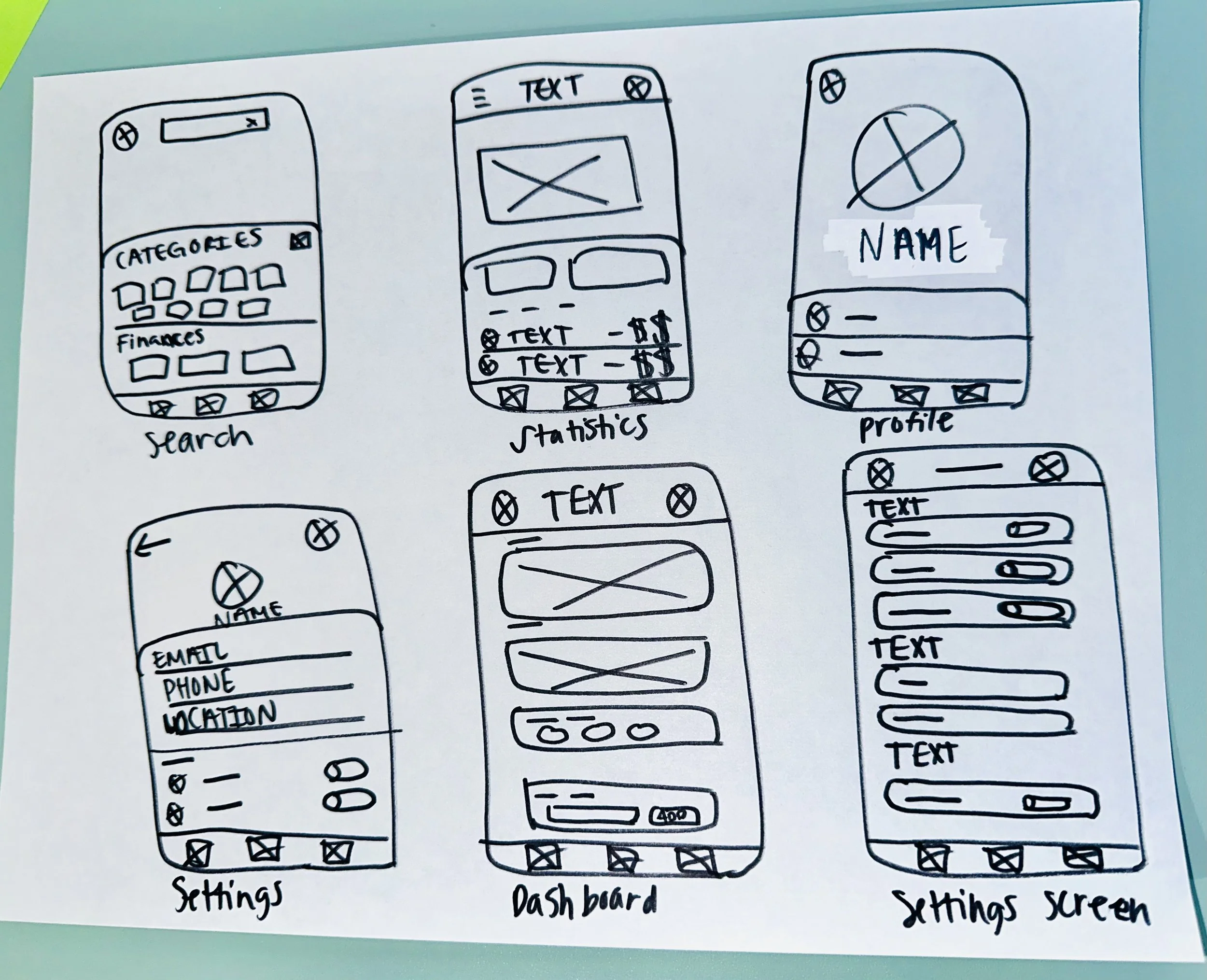
Early Sketches
The early sketches for Budget Buddy, a finance tracking app, laid the groundwork for creating a seamless user experience. These low-fidelity wireframes were essential in visualizing the app's structure and core functionalities, focusing on clarity and ease of navigation. At this stage, I focused on outlining the app's key screens to ensure the user journey was intuitive and well-organized.
The initial sketches included:
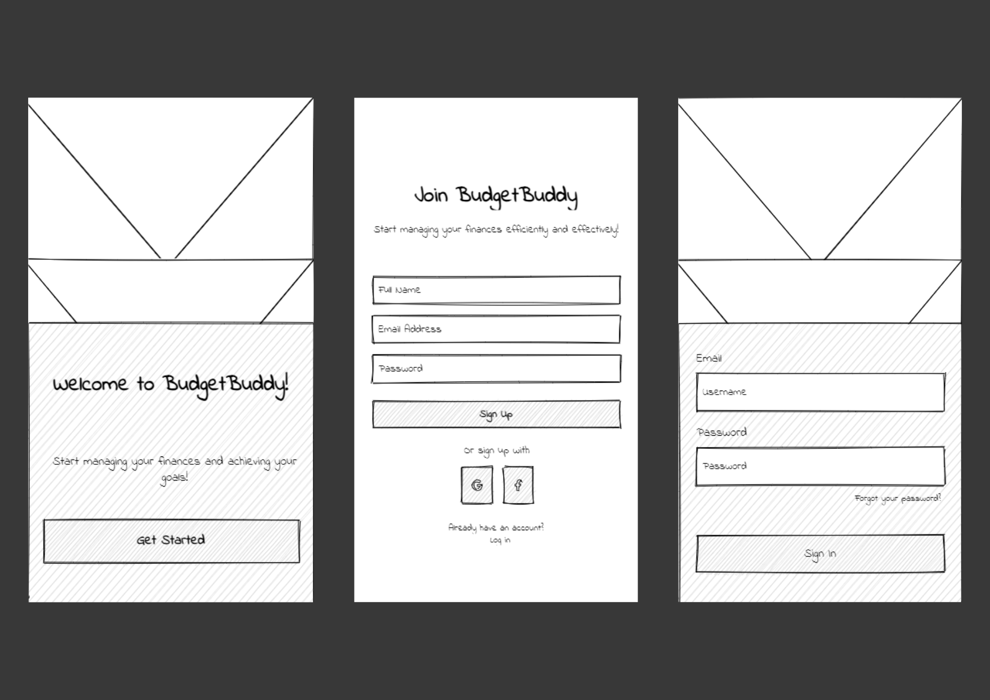
Welcome/Get Started Wireframe: Designed to greet users and provide an overview of the app’s features, enticing them to proceed with sign-up or login.
Login/Sign-Up Wireframe: A simple yet secure interface for new and returning users to access their accounts effortlessly.
Home Screen Wireframe: Featured a snapshot of the user's financial health with quick links to their budget, recent transactions, and account balances.
Search Wireframe: A streamlined search bar and filter options to help users locate specific transactions or budget categories quickly.
Statistics Wireframe: Highlighted detailed financial insights, including spending trends, income versus expenses, and customizable date ranges.
Profile Wireframe: Offered users a centralized area to update personal information and manage app settings.
Dashboard Wireframe: Served as the app's heart, showcasing a comprehensive view of budgets, goals, and categorized expenses.
Settings Wireframe: Provided users with control over notifications, security settings, and app customization options.
These sketches allowed for rapid iteration, ensuring every screen worked cohesively to support the user’s financial management goals. By focusing on the user’s needs early in the process, I set the foundation for a functional, user-centered design.
Low-Fidelity Wireframes
After refining the early sketches, the next step was to transition into low-fidelity wireframes. This phase involved translating the initial concepts into structured digital layouts that captured the app's functionality and user flow in greater detail. These wireframes served as a blueprint for Budget Buddy, allowing me to map out interactions and ensure each screen worked seamlessly together.
Key focuses during this stage included:
Establishing Visual Hierarchy: Ensuring important elements like total balances, spending categories, and recent transactions were prioritized on the home screen for quick accessibility.
Streamlining Navigation: Creating an intuitive menu structure that allowed users to effortlessly move between the dashboard, statistics, profile, and settings.
Refining User Journeys: Visualizing how users would complete common tasks like creating a budget, adding a transaction, or customizing financial goals.
Improving Clarity: Simplifying layouts to avoid visual clutter, focusing on clear typography and minimalistic design to guide user attention.


High-Fidelity Wireframes
With the low-fidelity wireframes finalized, the next step was to bring the design closer to its final form by creating high-fidelity wireframes. This phase focused on translating the app’s structure into polished, visually engaging layouts that reflected the branding, typography, and color scheme of Budget Buddy.
The transition to high-fidelity wireframes involved:
Defining the Visual Style: Incorporating a cohesive color palette and typography that conveyed professionalism and trustworthiness, while maintaining a modern and approachable aesthetic.
Enhancing User Interface (UI): Adding detailed components like buttons, icons, and sliders to make interactions feel realistic and intuitive.
Showcasing Data Representation: Designing clean, visually appealing charts and graphs in the Statistics Wireframe to highlight spending trends and financial insights effectively.
Building Brand Identity: Incorporating the Budget Buddy logo and consistent design elements throughout each screen to create a strong, recognizable identity.


Final Steps…
After completing the high-fidelity wireframes, I moved on to creating an interactive prototype that brought the Budget Buddy experience to life. This step allowed stakeholders to visualize the app’s features and functionality in action, ensuring the design was both intuitive and engaging.
The final steps included:
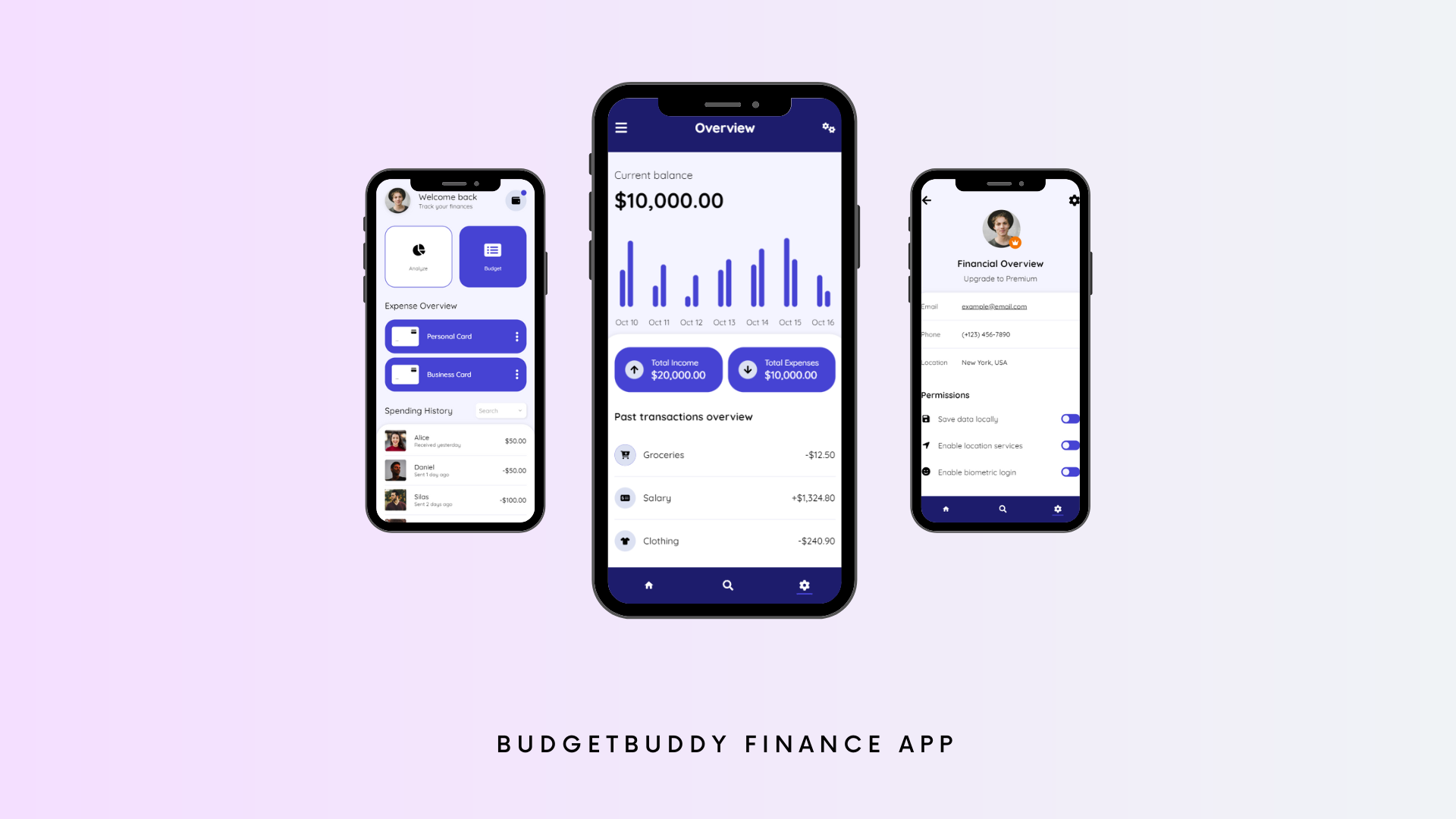
Interactive Prototyping: Linking screens to simulate real app functionality, enabling testers and stakeholders to explore features like tracking expenses, viewing detailed statistics, and customizing the dashboard.
Polishing Visual Details: Ensuring every design element—from typography and color scheme to iconography—aligned with Budget Buddy’s brand identity, creating a professional and cohesive appearance.
These final steps solidified Budget Buddy as a user-friendly tool for managing finances, delivering an accessible and visually appealing solution ready for development.
Final Prototype

Conclusion
Reflecting on the project, there are a few things I would approach differently:
More User Testing Earlier: While we conducted some user testing during the design process, involving users like James from the beginning would have been beneficial. This would have allowed us to iterate and refine the design based on real user feedback much earlier, rather than in the later stages.
More Customization Options: Although we aimed for simplicity, some users, like James, might benefit from more customization options. I would’ve liked to offer more flexible categorization and budgeting tools to give users more control over how they track their finances.
Polishing Wireframes: If revisiting the project, I would focus on refining and perfecting certain wireframes, improving layout, visual hierarchy, and overall clarity to enhance user understanding and ensure a seamless experience.
For this project, we gathered feedback from just one user, which limited the diversity of insights we could have obtained. Ideally, I would have liked to gather feedback from multiple users to get a broader range of perspectives and ensure that the design meets the needs of a wider audience. Additionally, incorporating more user personas would have helped create a more well-rounded understanding of different user types and their unique pain points. More comprehensive feedback and a diverse set of personas would have allowed for better-informed iterations, ensuring the app would cater to a wider variety of user needs and preferences.