
Festive Forecast
December 2023
The Holiday Hustle invites UX/UI designers to create winter-themed designs in just 2 hours, blending festive elements with functional, user-friendly design. I took on this challenge and created an app.
My Role: UX/UI Designer
Challenge Overview
In this two-hour design challenge, I came up with the idea of creating a holiday-themed weather app that combines functional weather reporting with festive design elements. The goal was to create an engaging, yet user-friendly interface that captures the spirit of the holidays while ensuring that the weather information remains clear and easy to access. The added constraint of a tight deadline simulated real-world project pressures, pushing me to work efficiently and think quickly, while still delivering a polished and well-rounded design.
The Design Process
The process began with low-fidelity wireframing, where I focused on the core features such as the weather summary, hourly and daily forecasts, and other key features. I drew inspiration from popular weather apps, prioritizing simplicity and ease of navigation.
Sketching: After gathering my initial inspiration, I sketched a rough layout to visualize the app's structure and features. This sketch helped me conceptualize how the weather information would be displayed, with areas for the current weather, hourly and daily forecasts, and the holiday-themed elements. The sketch provided a foundation for the wireframes and ensured the design would align with both user needs and the festive theme.
Wireframing: Given the tight deadline, I quickly moved into creating low-fidelity wireframes to establish the structure of the app. My primary goal was to ensure users could easily access key weather information while integrating subtle holiday-themed elements like snowflakes and winter icons.
UI Design: I focused on incorporating minimal, yet meaningful festive touches. Using cool tones and soft, 3D elements, I brought a winter vibe to the app without overwhelming its functionality. I added small touches like snowflakes for a playful feel while ensuring the design remained clean, with a modern typeface and intuitive iconography for easy navigation.
Simple Prototype Path: I created a straightforward prototype path to ensure the app was intuitive and easy to use. By focusing on a clean navigation system with clearly defined steps from the home screen to the hourly and daily forecasts, users could seamlessly transition between sections of the app without confusion. The goal was to keep the user journey simple and direct, minimizing any unnecessary interactions or distractions.
User Flow: To keep the experience seamless, I designed a straightforward user flow. Upon opening, users are greeted with the current weather, followed by a scrollable hourly forecast and daily predictions. I made sure to highlight the temperature and conditions in an easy-to-read layout while incorporating optional. The app’s design is friendly and accessible for all, with a winter house theme that appeals to both those who celebrate Christmas and those who do not.
Sketches & Low-Fidelity Wireframes
During the early sketch process for Festive Forecast, I focused on outlining the core functionality of the app and how it would present key weather information in a simple, user-friendly manner. I started with three key wireframes:
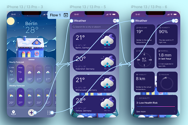
Main Screen Wireframe: This screen would display the user's location and current weather in degrees. I designed this to feature both the hourly and weekly forecasts, allowing users to quickly check the forecast for the day and the upcoming week. This screen was the heart of the app, providing essential weather data at a glance.
Weather in Surrounding Areas Wireframe: I designed this wireframe to allow users to see weather information for nearby locations. The goal was to help users quickly compare the weather in different areas, making it easier to plan for travel or see how the weather varies nearby.
Detailed Weather Information Wireframe: This screen delves deeper into the weather by showing additional details such as wind speed and direction, humidity, rainfall, compass orientation, visibility, air pressure, and air quality. This would help users who need more precise, in-depth weather data, especially those with specific outdoor plans or activities.
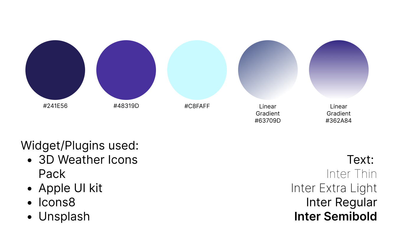
A unique aspect of my early design process was the decision to create a design element that would clearly showcase the HEX color codes I used for the project, as well as the fonts and any widgets or plugins that would be incorporated into the app. This step ensured consistency and visual cohesion across the entire app and would serve as a helpful reference throughout the design process. The early wireframes, alongside these design details, helped lay a solid foundation for moving forward with the next stages of development.


High-Fidelity Wireframes
After completing the early wireframes for Festive Forecast, I transitioned into the high-fidelity wireframe stage, refining the design to make it visually appealing and user-friendly. This phase focused on solidifying the layout, enhancing interaction elements, and finalizing the visual design. Here’s how I approached the high-fidelity wireframing process:
Refining the Layout and Visual Design
I began by polishing the layout of each screen, ensuring that all key data—such as location, temperature, hourly, and weekly forecasts—was well-organized and easy to read. These elements were given prominence to ensure users could easily find and interpret the weather information.
The HEX color codes I had selected earlier were now applied consistently across the screens, giving the app a cohesive and branded feel. This included using color for backgrounds, buttons, icons, and other UI elements, creating a visually cohesive experience for the user.
Typography and Visual Hierarchy
I focused on improving the typography to ensure clarity and legibility. By adjusting font sizes, line spacing, and contrast, I made sure the text was easy to read on all devices. The fonts used for headings, subheadings, and body text were applied consistently to maintain visual harmony.
Displaying Key Information
I made sure to enhance the presentation of weather data, focusing on clear, easily digestible information. Weather icons were used to visually represent conditions like wind, humidity, and air quality, making it quicker for users to understand the weather details at a glance.
I also paid special attention to the detailed weather metrics, such as wind direction, visibility, and pressure. These data points were organized into easily scannable sections, each labeled for clarity, so users could quickly find the information they needed without feeling overwhelmed.
Improving Interaction and Usability
I added interactive elements, such as buttons for switching between forecast views (e.g., hourly, weekly, and surrounding areas). These buttons allowed users to easily toggle between different types of weather data, improving the overall flow of the app.
In the high-fidelity version, I refined the layout of these interactive elements to ensure they were intuitive and didn’t clutter the screen. The design aimed to keep the app visually clean while still offering rich features to users.
Finalizing Visual Elements
I finished the design by adding subtle visual details like shadows, borders, and refined icons. These small design tweaks added depth to the interface, giving it a polished, modern look that was both functional and aesthetically pleasing.
Creating Design Documentation
As part of the high-fidelity process, I also created design documentation that included the HEX color codes, font choices, and descriptions of the widgets/plugins used in the app. This document would serve as a reference for developers, ensuring design consistency across all screens.

Protype
By this stage, I created a simple interactive prototype using the high-fidelity wireframes, which allowed me to bring the app to life in a basic, clickable format. I also mapped out a user flow from start to finish, outlining the journey a user would take—from opening the app to accessing detailed weather information. This user flow helped me ensure that the navigation felt intuitive and that key features were easily accessible. The prototype was a vital tool for identifying any friction points or areas where the user experience could be improved before moving on to further testing and refinement. With this prototype in hand, I was ready to gather user feedback and make any necessary adjustments.
User Flow Walkthrough
The user flow for Festive Forecast starts on the main screen, where users can see the hourly and weekly forecast. From here, they can navigate seamlessly by clicking the buttons at the bottom to switch between the three wireframes: the main weather screen, the surrounding areas weather, and the detailed weather metrics screen. This simple and intuitive flow allows users to easily access all the necessary weather information with just a few taps.
Skills Used:
Wireframing: Quickly creating rough layouts to visualize the app’s structure.
UI Design: Crafting a simple, clean, and visually appealing interface that blends function and aesthetics.
User Flow Design: Designing intuitive navigation to ensure a smooth experience for users.
Time Management: Efficiently working within the time constraints to deliver a polished concept.
Creative Problem Solving: Incorporating festive design elements while maintaining usability.
Typography: Choosing legible, accessible fonts to enhance readability.
Color Theory: Selecting a color palette that aligns with the holiday theme without overwhelming the user.
Sketching - Laying out initial ideas to guide the design process.
Prototyping - Developing a straightforward, clickable prototype for testing.
Iconography - Creating intuitive and holiday-themed icons.
The Outcome
The Festive Forecast project pushed me to think quickly and iterate at a fast pace. Though the final product wasn’t fully polished and had minimal functional, the process taught me how to make effective design decisions under pressure, balancing form and function. Ultimately, the design successfully met its goal of delivering a cheerful, holiday-themed app that provided essential weather information, and it reinforced my ability to adapt and create impact within tight deadlines.