
Foodily
August 2nd 2023 to November 30th 2023
A 3-month sprint, freelancing project with a small team of 5 people: a project manager, front-end/back-end developers, a visual designer, and myself.
My Role: UX/UI Designer
The Backstory
Foodily began as an idea from a small group of passionate entrepreneurs who saw the challenges busy people face in maintaining a healthy diet. This start-up team wanted to make nutritious, balanced meals easily accessible, envisioning an app that would offer personalized meal delivery for people juggling work, family, and social commitments. While they didn’t come from backgrounds in nutrition or tech, their vision was clear: to create a meal delivery service that could adapt to diverse dietary needs and preferences, whether plant-based, gluten-free, or low-carb. Sustainability and local sourcing were also key values for Foodily, aiming to support local farms and eco-friendly practices.
Recognizing the importance of a user-friendly, attractive interface, the team knew they needed a skilled UX/UI designer to bring their vision to life. They contacted me after seeing my work, confident that my experience in crafting intuitive, engaging digital experiences would be a perfect match for Foodily.
In a tight four-week sprint, I joined their core team of five—a project manager, front-end and back-end developers, a visual designer, and myself. Together, we worked to design an app that would allow users to effortlessly explore meal options, customize orders, and track deliveries, ensuring that Foodily’s values of convenience, accessibility, and sustainability were reflected in every aspect of the user experience.
The Challenge
For Foodily's four-week sprint, the theme was "Nourishing Meals, Delivered with Love." with a heartfelt mission: to create an app experience that makes healthy eating feel personalized, enjoyable, and accessible for every user.
We started by identifying what truly mattered to Foodily’s audience: they wanted meals that felt nourishing, were easy to order, and reflected Foodily’s commitment to wellness and sustainability. Through user feedback and brainstorming, we pinpointed one major challenge: meal delivery apps rarely achieve the balance of ease, personalization, and care that users seek.
“I just want something healthy and easy, so I don’t have to think about what’s for dinner after a long day. It’d be amazing to skip the grocery store and still feel like I’m eating well.”
— EMMA, 30
Emma’s challenge reflects a common struggle among Foodily’s users: while they love the idea of healthy, ready-to-eat meals, they often feel disconnected from the process. Existing apps often leave them with limited options that don’t cater to specific dietary preferences, making the experience feel impersonal and frustrating. This insight became the core of our focus for the sprint—designing an app that truly embodied Foodily’s theme of nourishment and care.
With this vision in mind, the sprint challenge was threefold:
Develop a Warm, Inviting Interface: Design an intuitive app experience that guides users from browsing to checkout effortlessly, with a touch of comfort and care at every step.
Create Personalized Meal Options: Integrate a meal customization feature that allows users to filter by dietary preferences, health goals, and portion sizes, making every order feel tailored and nourishing.
Launch a Cohesive Brand Identity: Ensure that Foodily’s mission—nourishment, health, and sustainability—is reflected across all digital touchpoints, from the app design to promotional materials, creating a brand that feels inviting and supportive.
In the end, our goal was to create a meal delivery experience that felt less transactional and more like a warm, personal service—delivering not only food but a sense of care and nourishment, just like Emma and many others want.
Research & Planning
To validate our ideas and ensure we were truly addressing user needs, I conducted a series of user interviews focused on understanding user behaviors, challenges, and preferences regarding meal delivery and healthy eating.
The first two interviews confirmed our assumption that busy adults like Emma seek convenience in their meals and tend to prioritize ease and speed. They often compromise on meal quality or healthiness due to a lack of time or energy.
The last two interviews revealed two critical insights:
People are more likely to prioritize healthy options if they’re conveniently accessible and feel personalized to their dietary goals.
The need for customization is especially high among users with specific health or dietary restrictions, as they often feel other meal delivery services overlook these needs.
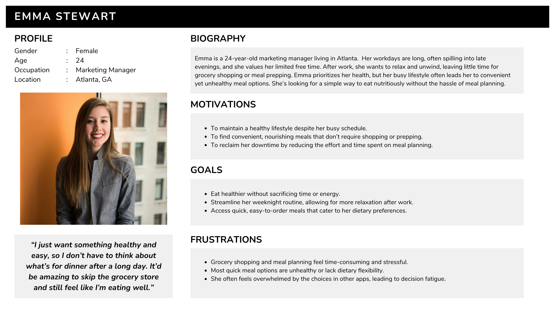
Based on these findings, I developed two user personas to guide our design:
Emma is a 30-year-old busy professional who values simplicity and ease in maintaining a healthy lifestyle.
Emma prefers services that reduce the time spent on grocery shopping and meal planning. This way, she can relax and enjoy her downtime without worrying about what to eat.
Leo is a 26-year-old health-conscious athlete who prioritizes nutrition and convenience to support his active lifestyle.
Leo seeks services that offer quick access to high-protein, nutrient-dense meal options, enabling him to stay on track with his fitness goals without the hassle of meal planning or preparation. He values ingredient transparency, customizable nutrition options, and reliable tracking features, so he can focus on training while knowing his nutritional needs are met.

Designing the Solution
To validate our ideas and ensure we were truly addressing user needs, I conducted a series of user interviews focused on understanding user behaviors, challenges, and preferences regarding meal delivery and healthy eating.
The first two interviews confirmed our assumption that busy adults like Emma seek convenience in their meals and tend to prioritize ease and speed. They often compromise on meal quality or healthiness due to a lack of time or energy.
The last two interviews revealed two critical insights:
People are more likely to prioritize healthy options if they’re conveniently accessible and feel personalized to their dietary goals.
The need for customization is especially high among users with specific health or dietary restrictions, as they often feel other meal delivery services overlook these needs.
Based on these findings, I developed two user personas to guide our design:
Emma is a 30-year-old busy professional who values simplicity and ease in maintaining a healthy lifestyle.
Emma prefers services that reduce the time spent on grocery shopping and meal planning. This way, she can relax and enjoy her downtime without worrying about what to eat.
Leo is a 26-year-old health-conscious athlete who prioritizes nutrition and convenience to support his active lifestyle.
Leo seeks services that offer quick access to high-protein, nutrient-dense meal options, enabling him to stay on track with his fitness goals without the hassle of meal planning or preparation. He values ingredient transparency, customizable nutrition options, and reliable tracking features, so he can focus on training while knowing his nutritional needs are met.
The First Steps…
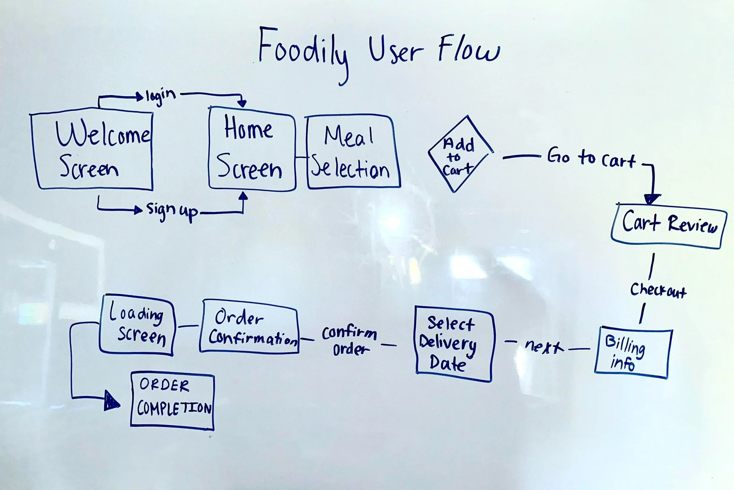
Focusing on Leo and Emma allowed us to address various user needs while ensuring the platform remained accessible and valuable to various user demographics. The first step in the Foodily design process was to create a detailed user flow map. This map helped visualize the entire user journey from landing on the platform to completing their meal plan or recipe selection. Key user actions, decision points, and potential barriers were identified to ensure the experience was intuitive and easy to navigate. The flow focused on:
Entry points (e.g., landing page, sign-up)
Meal plan creation process
Recipe selection
Navigating dietary preferences and allergens
Accessing additional features like shopping lists or nutrition tracking
The goal was to ensure every interaction felt smooth, purposeful, and aligned with the needs of users like Emma and Leo, ensuring a seamless transition from one step to the next.
Early Sketching
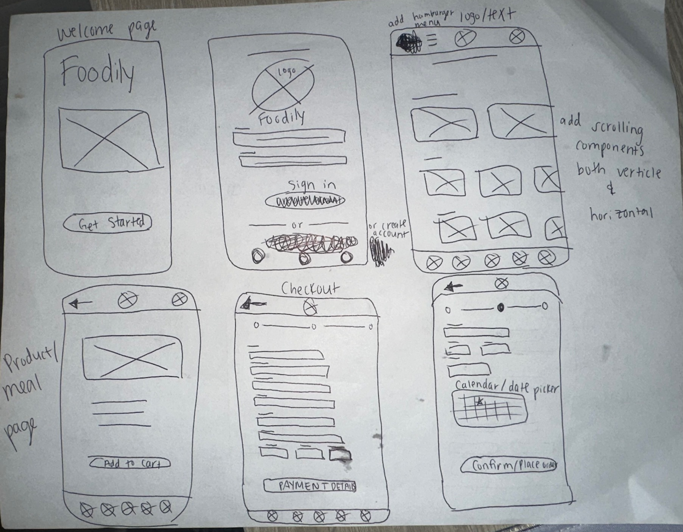
After defining the user flow map, the next step was to convert these ideas into early wireframe sketches. These low-fidelity wireframes served as the foundational blueprint for the platform, enabling us to visualize the layout and structure of key screens without diving into visual design details. We focused on screens like the homepage, recipe search, and meal planning interface, experimenting with different layouts and element placements to streamline user tasks. This phase helped pinpoint the most efficient paths for users to reach their goals, allowing for rapid iteration and the identification of potential usability issues before moving on to high-fidelity designs.
The early sketching phase included wireframes for key screens such as:
Welcome page
Login/Sign-up process
Meal selection
Detailed meal view
Calendar date selection
Checkout process
Low-Fidelity Wireframes
We then developed low-fidelity wireframes to bring these ideas to life, aiming to create a seamless user flow that would cater to Leo’s need for efficiency and Emma’s interest in personalized meal planning. At this stage, we received feedback from our client, who shared a list of potential features gathered through interviews with local focus groups. We carefully assessed the value each feature would bring to users like Leo and Emma, aligning them with Foodily’s goals. This feedback allowed us to refine our design further, ensuring that every element in the platform not only met the needs of our personas but also supported the overarching mission of Foodily.

Brainstorming the Redesign
During my brainstorming session, I needed to dig deep and come up with a fresh design for the detailed meal description wireframe that would allow users to easily read about the meal and then quickly add it to their cart. This process was heavily influenced by Leo's and Emma's pain points:
Leo: Needs meals that align with his specific macros and support his lifestyle goals.
Emma: Struggles with food allergies and often feels discouraged when food apps don’t clearly list allergen information.
To address these challenges, I used a whiteboard to sketch out the current design and explore potential improvements. I wanted to ensure that the new design would provide a clear and concise way to present meal details, such as ingredient lists, preparation instructions, and allergen information, making it easy for users like Leo and Emma to make informed decisions.
This led to a new and improved version where I:
Moved the name of the meal to the top: This made it more prominent and easier for users to identify the meal right away.
Condensed the food description: I streamlined the text to make it more concise and easier to read, ensuring users could quickly understand what the meal is about.
Listed allergens clearly below the description: This addressed Emma’s concern by making allergen information immediately visible and easy to access.
Organized macros content in boxes: The nutritional information was grouped into clearly defined sections, making it easy for users like Leo to spot key details like macros at a glance.
Moved the "add to cart" button lower: By shifting the button slightly, I ensured the page had a more natural flow and reduced clutter, improving the overall usability.
After refining these details, I transitioned into creating high-fidelity wireframes to solidify the redesign and bring the improved meal description wireframe to life.


Final Steps: High-Fidelity Wireframes & Prototype
The final steps for the Foodily project focused on completing the high-fidelity prototype and creating a comprehensive mockup that showcased the entire user journey. After finalizing the redesigns, I translated the detailed wireframes into polished, high-fidelity prototypes that captured the visual design and interactions of the platform. This stage ensured that every element—colors, typography, spacing, and button interactions—aligned seamlessly with Foodily's branding and user goals.
To provide a complete picture of the user experience, I created a mockup illustrating the process from start to finish, beginning with the “Get Started” welcome page and ending with the checkout confirmation screen. This mockup demonstrated how users would:
Navigate the onboarding flow and sign up or log in.
Browse meals with clear descriptions, allergen information, and macros.
Add selected meals to their cart through an intuitive interface.
Customize their meal plan using the calendar-based meal-planning tool.
Proceed to checkout, reviewing their selections before finalizing their order.
This end-to-end mockup allowed for final user testing, ensuring that the flow was intuitive and met the needs of users like Emma and Leo. By visualizing the entire process, I was able to identify any remaining friction points and deliver a design that provided a seamless, user-friendly experience.
Final Prototype

Final Wireframe
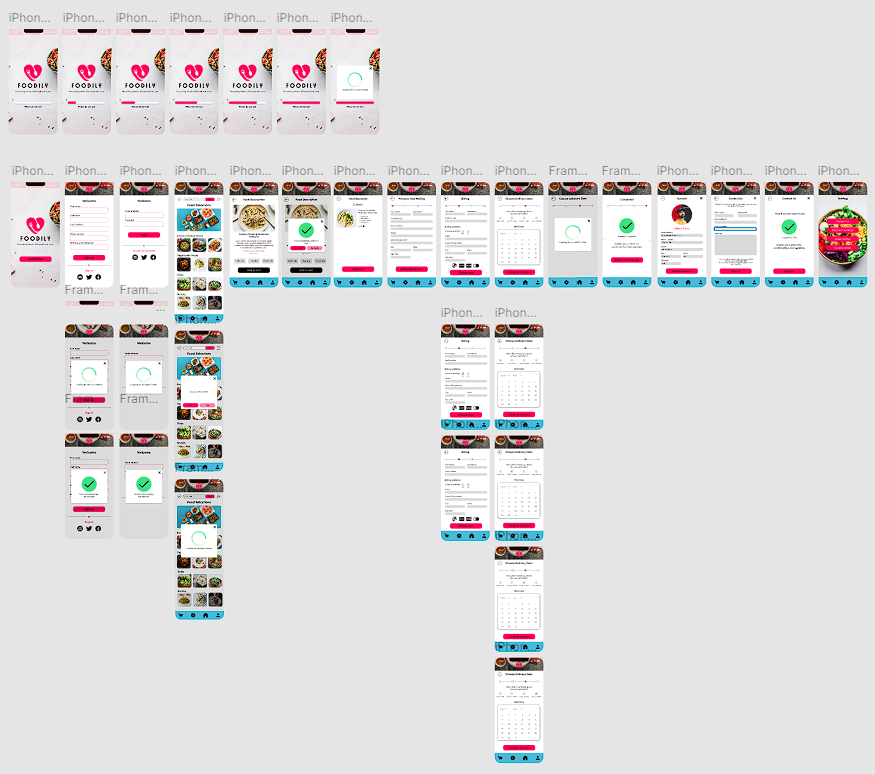
Walkthrough Process: From Start to Finish
Conclusion
If I were to revisit the Foodily UX/UI project, I would focus on:
Early User Testing: Conduct thorough user testing during initial wireframing to catch usability issues early.
Customizable User Profiles: Allow users to set specific dietary goals and highlight allergens, making their experience more personalized.
Data-Driven Insights: Use analytics to track user interactions and engagement, enabling continuous improvements based on actual user behavior.
Working on this project was a valuable experience, allowing me to create a user-focused design that addresses the unique needs of users with specific health and dietary goals. The enhancements I implemented not only streamlined the user journey but also ensured clarity and ease of use. This project underscored the importance of early testing, personalization, and data-driven refinement in creating effective UX/UI solutions for health-focused apps.
Looking back, I see some key points where we could have proposed shifting our focus toward deeper UX research. Instead, our team concentrated on iterating the design and refining new features. However, during the client presentation, we made recommendations to address usability challenges and suggested further UX research as a valuable next step.
A few weeks after the project concluded, I had the chance to reconnect with our client. It was encouraging to hear that they were actively using our screens and user flows to shape Foodily’s direction. I look forward to seeing how the platform evolves as they continue to implement our insights and prioritize a user-centered experience.